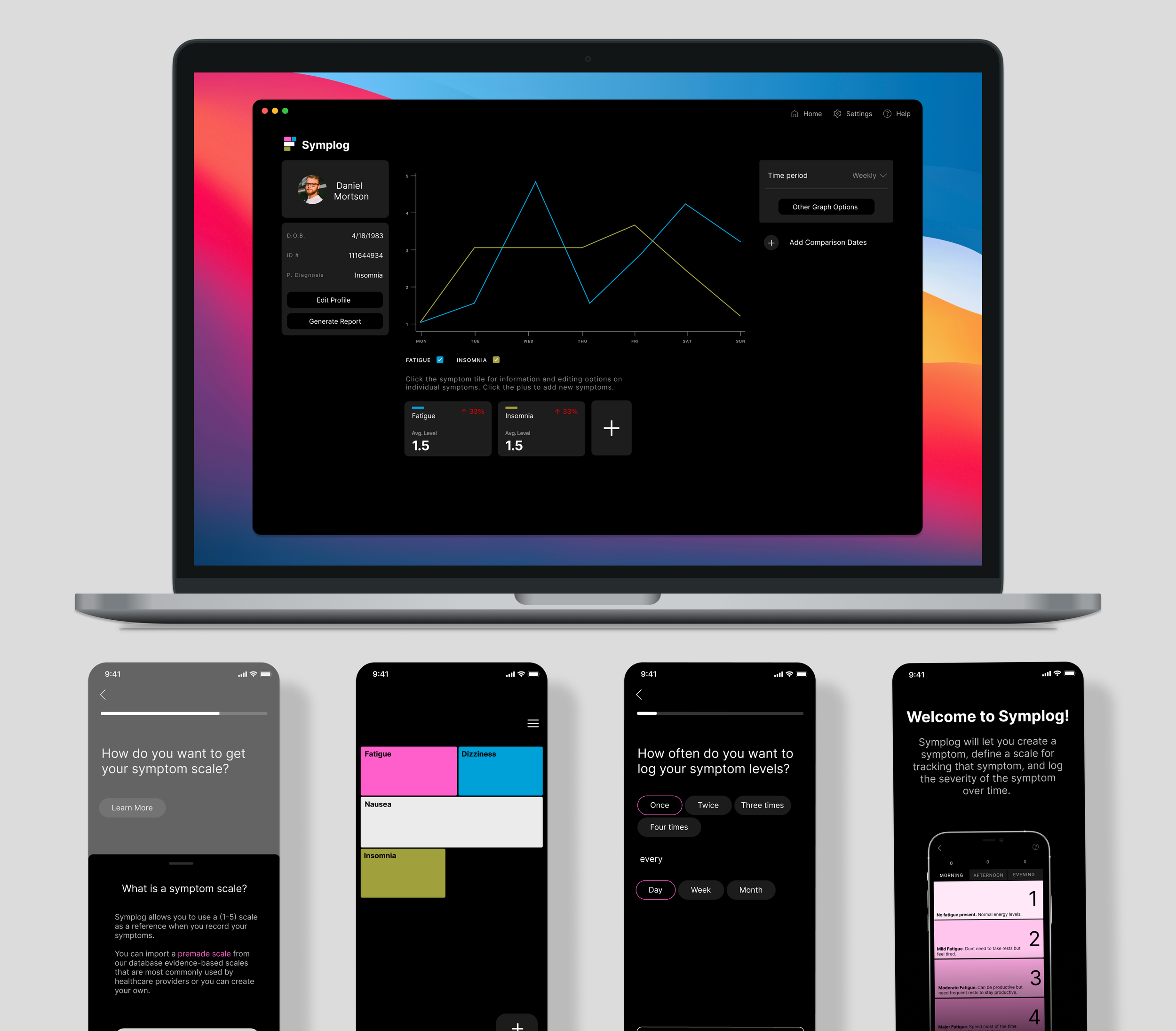
Symplog Symptom Tracker
The healthcare industry is under tremendous financial and social pressure and needs technology to help lessen the burden on both patients and providers. Patients with chronic illnesses often struggle tracking the symptoms and have difficulty presenting their symptoms to their healthcare providers. This process of tracking and summarizing symptom changes in healthcare appointments leads to mistrust and frustration for both parties. I sought to create a symptom tracking app the would assist patients in objectively tracking their symptoms, build trust between patient and providers.
Patients can flexibly track symptoms using a minimalist interface with a predefined scale to ensure objectivity and accuracy. Data can be easily analyzed and presented to providers as the basis for further treatment decisions.
Major Flows and Features
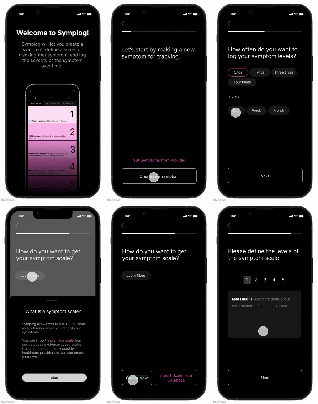
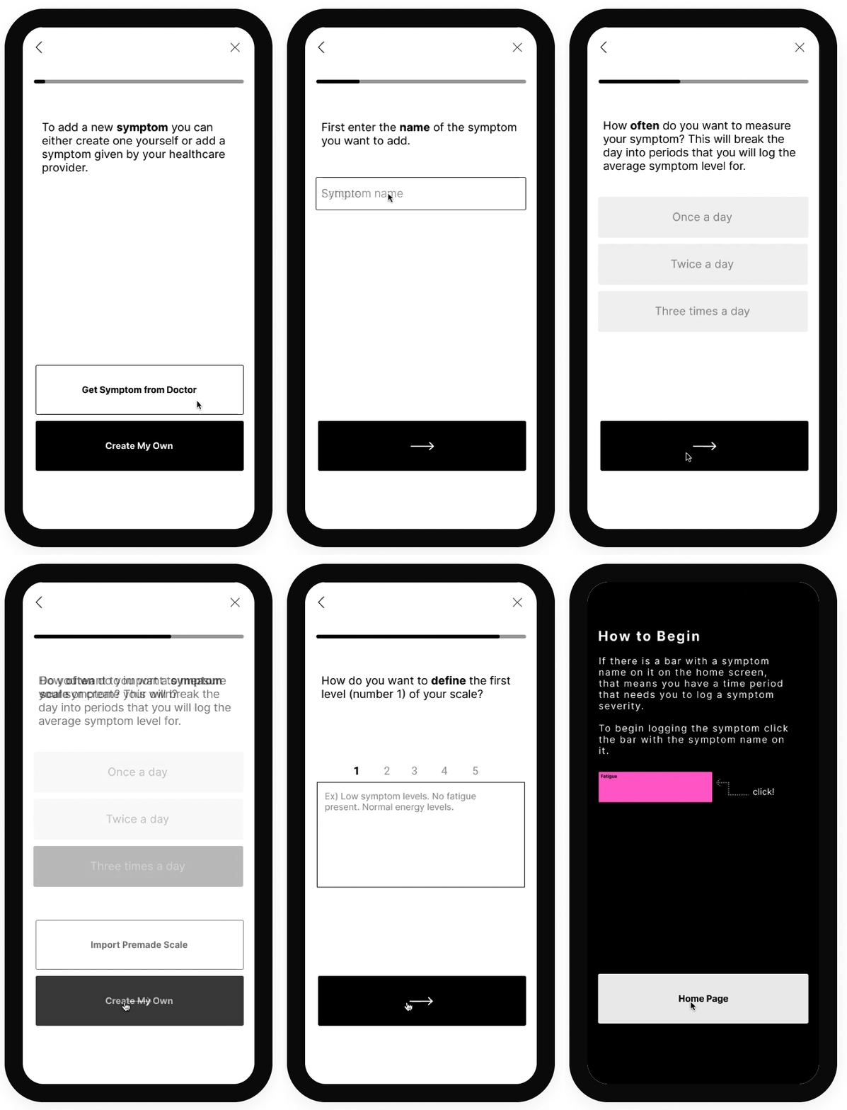
The Add New Symptom Flow allows the user to add a new symptom that they want to track. They can set the symptom name, how often they want to to track the symptom, and set the symptom scale which allows them to define the meaning behind the values of their symptoms scale (for example what is the difference between rating your fatigue a ⅕ or a 5/5).
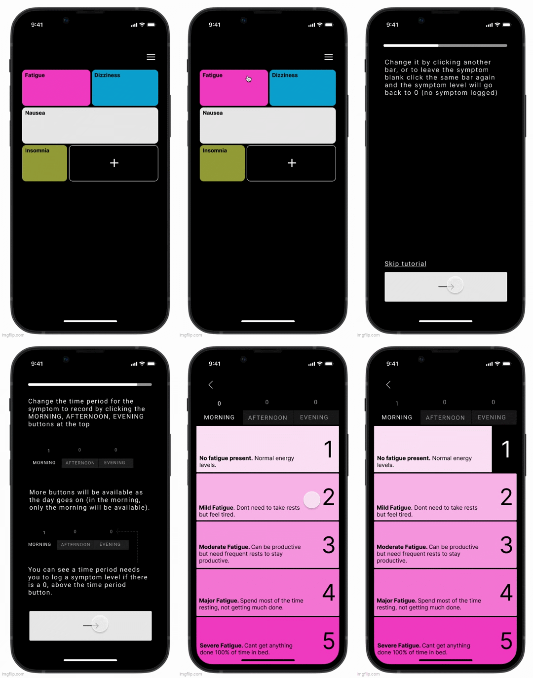
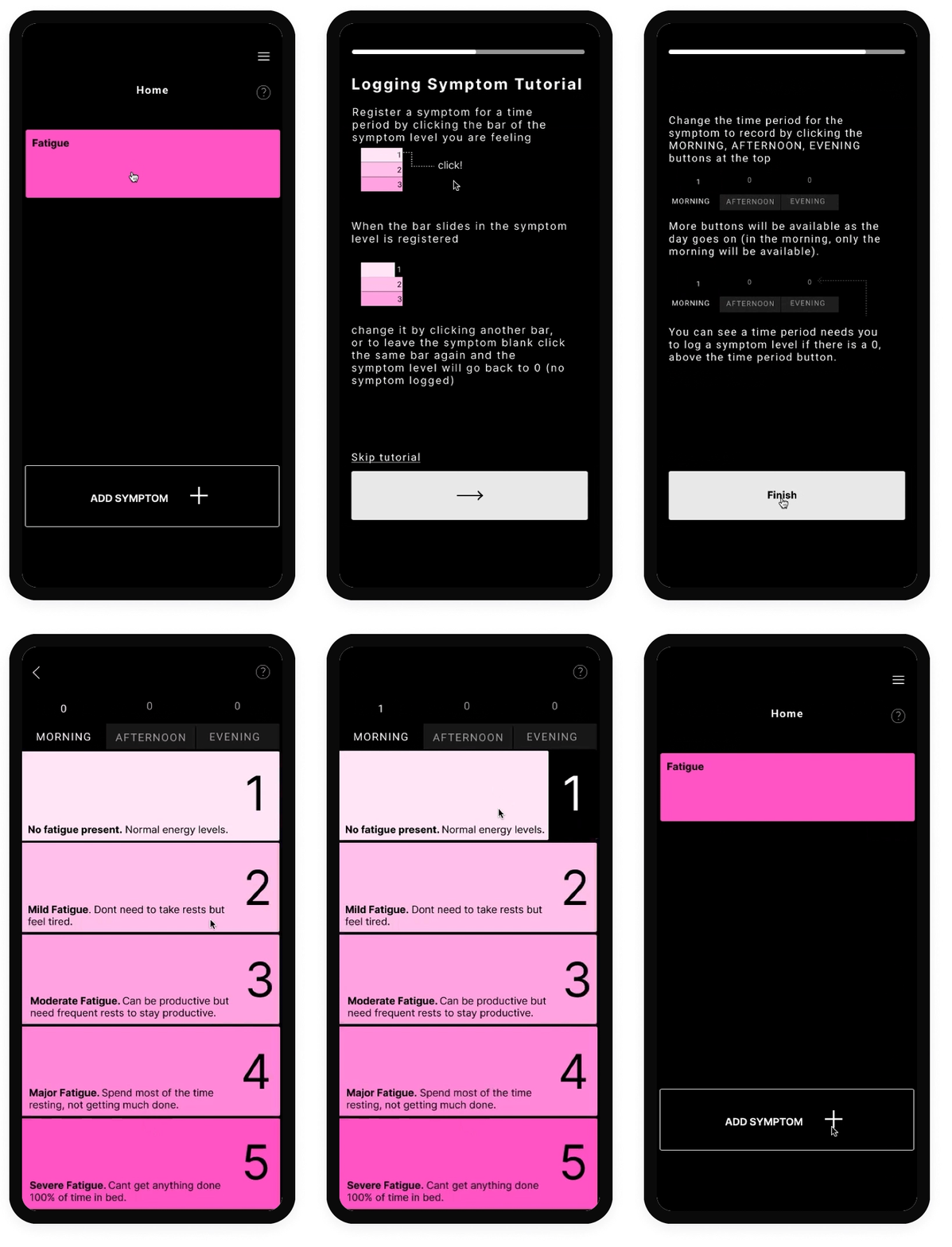
The Logging Symptom Value Flow allows the user to log a symptom value for a time period. The flow begins at the front page where the presence of a colored symptom box indicates that there is a time period that requires a symptom to be recorded. The different sizes of the symptom boxes show the general severity of the symptoms that have been recorded so far, thus at a glance the user can see which symptoms have been more severe. There is also a “plus” button that will bring the user to the add new symptom flow for adding a new symptom to track. After recording the symptom, if there are no more time periods requiring symptom recording, the symptom box will disappear.
Desktop Portal Screen Mockups
I have included several designs for potential desktop portal screens that could support the mobile experience and give healthcare providers a potential tool to access their patients' symptoms. The add new symptom screen would allow the user or provider to add a symptom via the desktop. The main Symplog homepage screen would just allow the user or provider to see general symptom trends and graphs. I also included a potential page for a provider portal that would allow healthcare providers to track their patients symptoms, add a new patient, see alerts for symptoms their patients are tracking that exceeded a preset threshold.
Report Generation for Healthcare Providers Feature
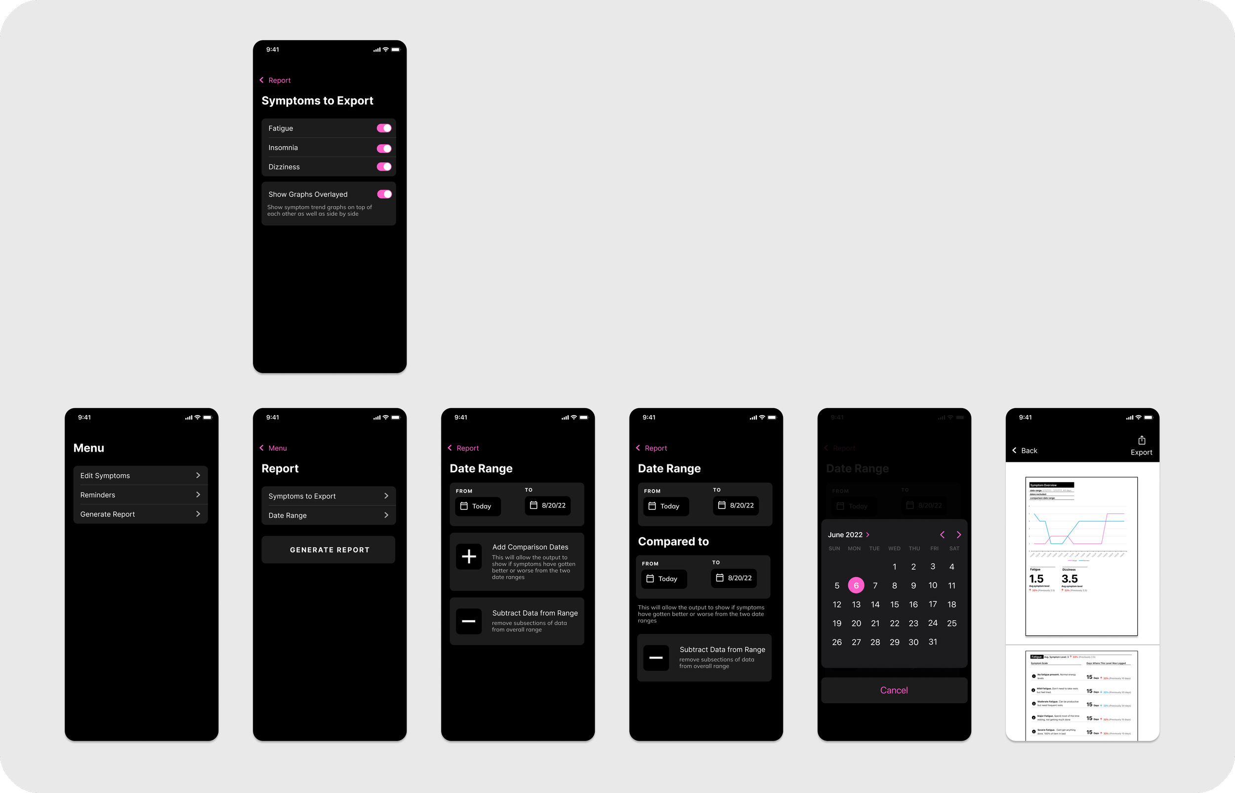
This feature allows you to generate a PDF data report for presenting to a healthcare provider to review how symptoms are changing. The user could specify the dates for the report to cover, if the report should include multiple symptoms, if the report should compare the data between two sets of dates (which could allow the provider to see how symptoms have changed specifically between two dates). The specific format for presenting the data can also be seen in the included mockup. This could be invaluable for healthcare providers to be informed about how a patient's symptoms are changing to inform decision making for future interventions or inform how past interventions are working.
Add Reminder Feature
This feature would be for users to add push notifications to remind them to log symptom levels for either whenever a new symptom needs logging or at specific times. A basic but important feature because if a user doesn't remember to regularly record symptoms the whole application is pointless.
Mass Edit Feature
This mass edit screen offers a potential mockup of the “mass edit” feature that would allow users to go back and edit symptoms that they had already logged for different dates or times. This tool is much more suitable for changing multiple data points and going to different dates to review symptoms than the primary symptom logging feature–which is good for entering a single data point accurately but unwieldy for entering multiple data points or changing the date of entry.
Graph Feature
This graph screen feature could allow users to see a quick overview of their symptoms over a specific period of time as well as some key statistics for the symptom and trend analysis. This could be useful for users to get a quick overview of their symptoms over a period of time without having to go through the trouble of generating a pdf report.
The Foundation of the Application
My Background and Marketplace Need
The basis for this app was in part my healthcare background. In my thousands of hours of exposure working and volunteering in an outpatient clinical setting, I saw primarily patients with chronic illnesses (ie thyroid disorders, mood disorders, chronic fatigue syndrome etc) and was able gain insight into their struggles with managing their illnesses as well as interfacing with providers.
500+ hours of clinical work.
Attended medical school
Worked as a medical translator
Context and the Current State of Healthcare
Healthcare today is under enormous pressure, primary care providers have large patient panels of 2,000 patients, see 20-35 patients a day and have an average appointment length of 10-15 minutes due to reimbursement pressures from the insurance industry. Additionally doctors have admitted that the shorter appointment times are putting patients at potential risk.
Who bears the burden of a overstressed healthcare system? Patients with complex conditions with subtle changes in symptoms can be misdiagnosed. In fact, most patients with complex chronic illnesses require multiple visits to multiple doctors before receiving a correct diagnosis and there is an additional general increase in cases of medical neglect or malpractice as well. With the increase in the incidence of chronic illnesses and increasing pressure on the medical system, this problem will only get worse.
How does a symptom tracker help address these issues? Symptom trackers reduce the burden on both providers and patients to reduce appointment times and inaccuracies in both tracking and communicating symptoms. After an initial diagnosis, providers will recommend a course of treatment and the patient must track if the symptom is getting better or worse and decide whether or not to change the treatment. This tracking and assessing is made infinitely more accurate and easy by the use of a symptom tracker.
Primary and Secondary Research
My first step was to understand the challenges faced by patients with chronic illnesses and healthcare providers in terms of tracking and communicating symptoms and defining the market need for symptom tracking application. To do this, I conducted both primary and secondary research.
Secondary Research
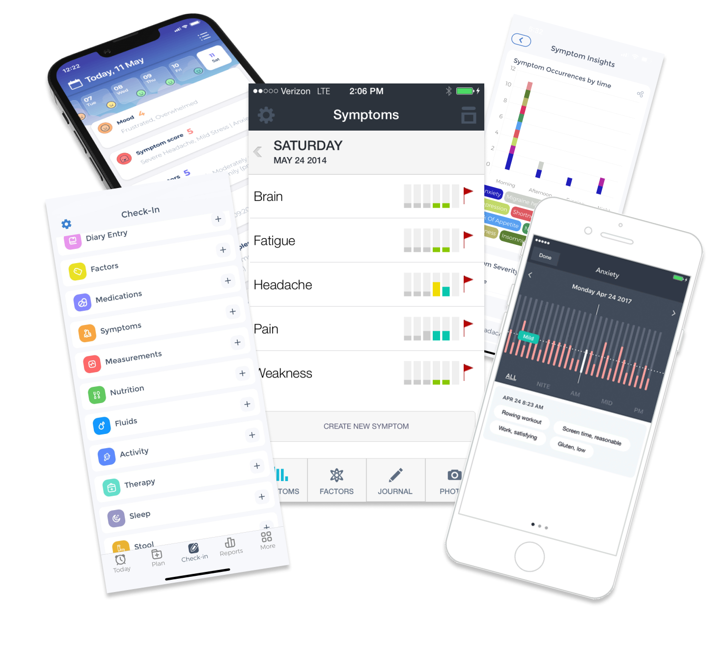
I did a literature review of current healthcare conditions to further understand the environment that would create need for a symptom tracker app (see the “Context and the Current State of Healthcare” above). I also completed a competitive analysis of popular symptom tracking apps to discover where possible areas of improvement would be. I discovered the following:
Current applications often have bloated feature sets, that are immediately exposed to the user, creating a maximalist, overwhelming user experience.
Current applications often have confusing UI/UX with no clear guidance, tutorial or onboarding.
There is a limited focus on output and data visualization. The primary use of a symptom tracker from a physicians point of view is to help see if treatment/intervention is working or not but most symptom trackers have terrible data visualization and data output functions that make it difficult for physicians to assess if anything has changed.
Primary Research
I conducted user interviews with six patients with chronic illness and two physicians to further understand the problems patients and physicians face when tracking and communicating symptoms. I then analyzed and categorized the results using affinity mapping.
Research Findings
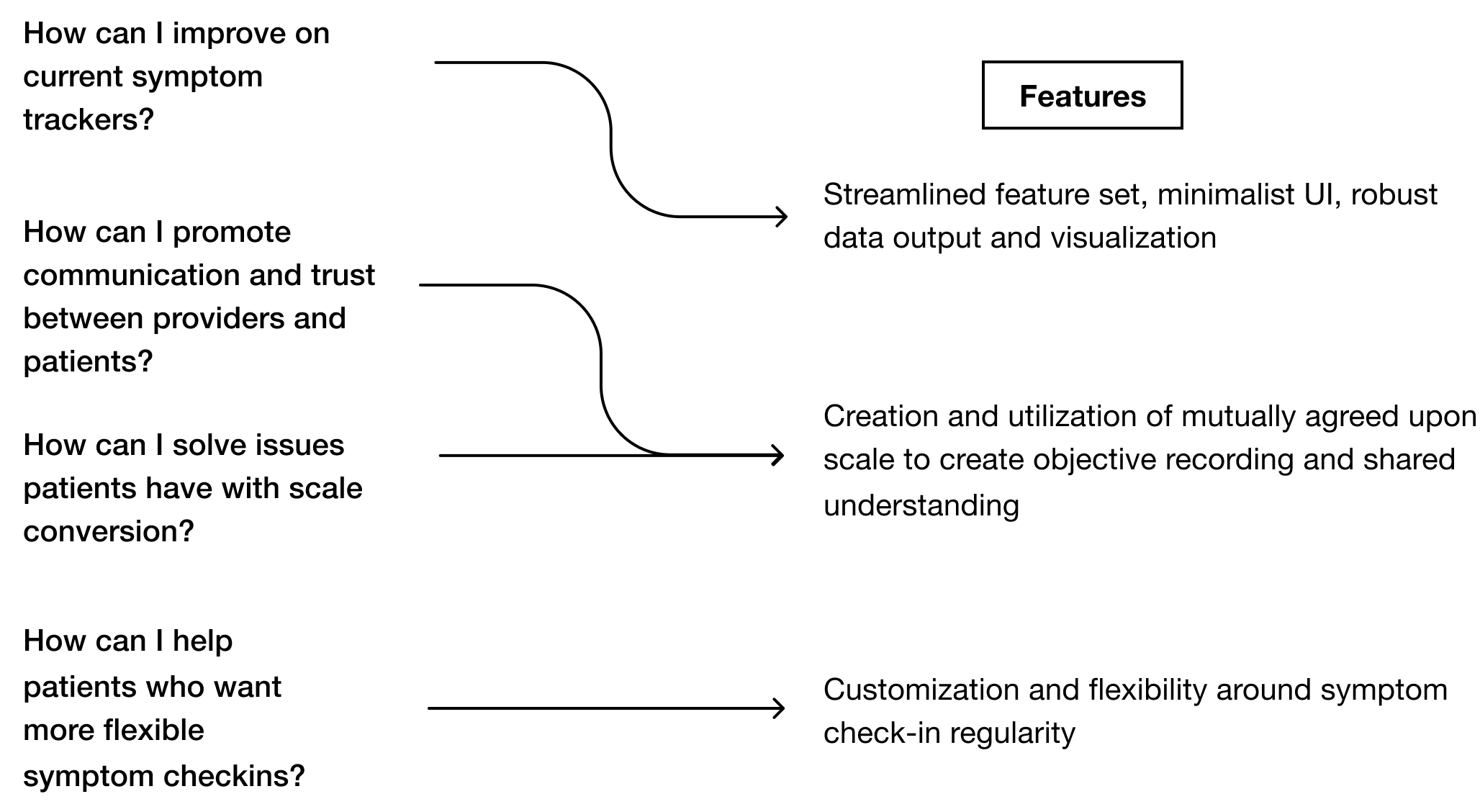
My primary research provided me with a deeper level of insight into some of the pain points that both patients and providers experience when it comes to tracking and communicating symptoms. The research yielded three major findings:
Communication and Trust
Physicians don’t trust patients. Patients don’t feel listened to or taken seriously.
Scale
Has issue with scales of doctors office and converting between personal scales and doctors.
Symptom Check-in Flexibility
Patients wanted more flexibility for how often they could check their symptoms
Ideating
My next step was to ideate based on the key research yields. I came up with over 20 different feature ideas. To narrow down this list, I ranked the ideas based on feasibility and impact, promoting the feature ideas that directly addressed my major research findings.
Lo-fi Prototyping
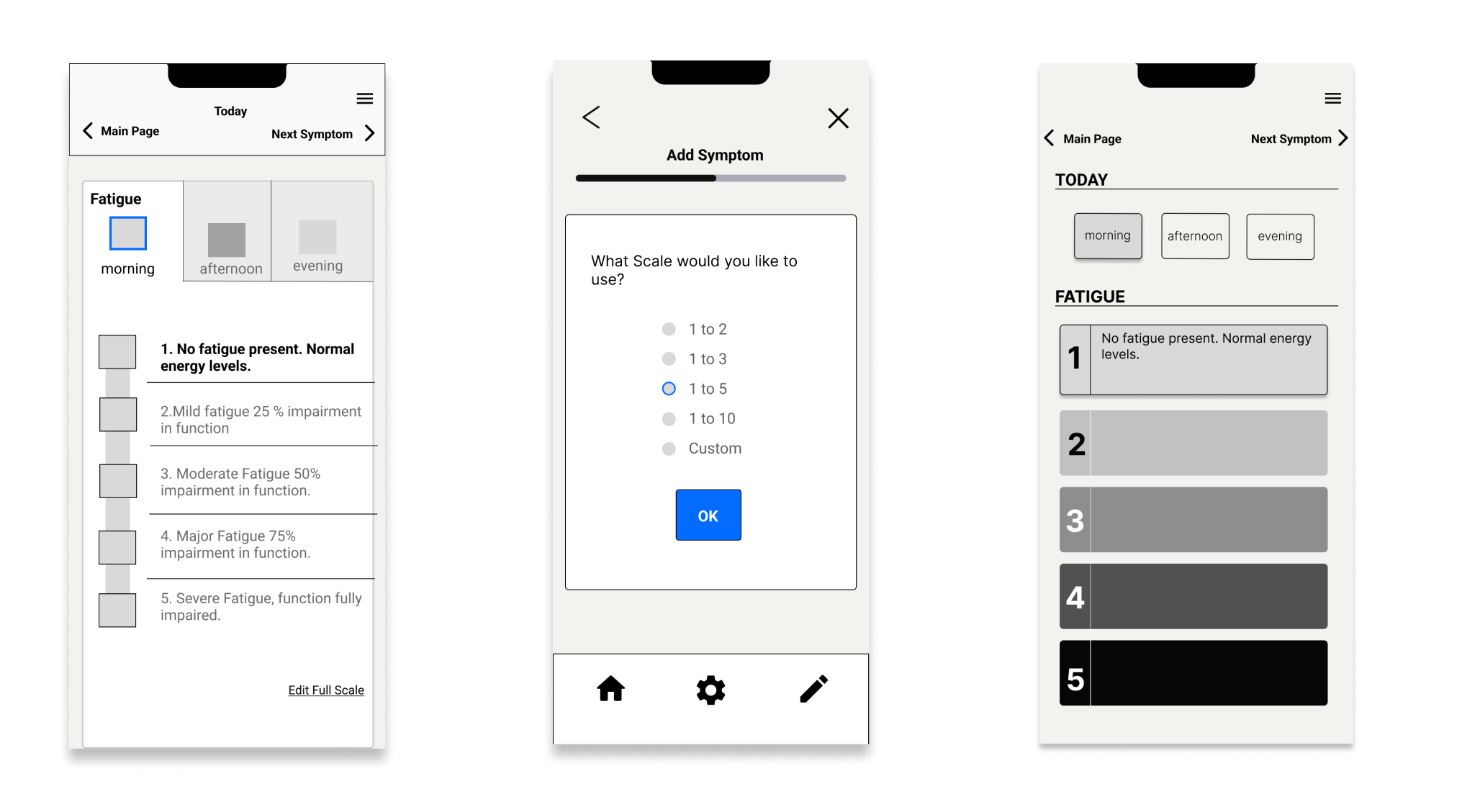
Based on these core functionalities, I designed a lo-fi prototype, which I produced using figma. I focused initially on the “adding a new symptom for tracking” and the “logging symptom severity” flows as they were the most core features. These features were then tested with random user groups for rapid iteration.
Design Problems Encountered During Low-Fi Testing:
1. How to ensure that patients interacted with the scale? It was tempting to make the scale incidental and have it be an optional pop up while logging symptom severity—that would improve the speed and simplicity of symptom logging. But it was an important feature of the app to ensure users were objectively recording symptoms, so I needed my design to funnel them into direct scale interactions every time they logged a symptom.
2. Some initial user feedback lead to the design of a slider for inputting symptom severity. I later changed this to button entry after doing secondary research on sliders general effect on UX experiences. The users of this application are a potentially vulnerable population that may have fine motor disabilities that could make effectively using a slider (which requires hand control for accuracy) difficult.
3. It was difficult to balance wanting to give the users many options for customization and control over how they logged symptoms with also wanting to create a simple and usable user experience. Too much up-front options for customization potentially overwhelmed our initial user testers, that could lead to people dropping the app as soon as they were confronted with all the options which was not what I wanted.
Hi-Fidelity User Testing
I then created a high-fidelity prototype that was then tested with eight users to define areas where the application could be further improved. Some of the key features of the high fidelity prototype include large chunky buttons for ease of use (even if user has difficulty with fine motor control) and a minimalist modern UI.
Major Iterations after User Testing:
1.One of the major corrections at this stage was removing the “morning, afternoon, evening” indicators of the cards. Originally they were shown to demonstrate if the user had recorded a symptom for that time period. 30% of Testers found them confusing, and tried to click in to them to register symptom levels. This overview functionality was replaced by a newly created flow, the mass symptom editor.
2. I created tutorial sections for individual flows. Many testers hadn’t used a digital symptom recording applications before and needed a tutorial section to help them navigate the application successfully.
3. I created an introduction to the app. Some of the testers didn’t know what to expect with the app and wanted a more robust introduction to be welcomed and help them understand what the end result of the application would be.
High Fidelity Flows After First Round of Iteration
Adding New Symptom Flow
Created Scale for Symptoms
Addresses communication and trust issue with provider by ensuring common language and understanding
Flexible Custom Symptom Check-ins
Allows for flexibility in defining the number of checkins which was major point of user research
Logging Symptom Flow
Minimalist Flow
Simple, minimalist flow with large buttons is easy to understand and doesn’t have any extra visual burden
Scale Access
User has to interact with scale when recording symptoms which ensures increasing objectivity in symptom reccording
Project Takeaways
User Testing is king: a new flow or feature should be put in front of as many potential users as possible as often as possible and repeatedly tested. The most progress on this project happened after a large amount of user testing. When there were development periods with less testing, the design often went in directions that later had to be corrected.
Users tended to want guidance and support. Most users appreciated an optional onboarding and tutorial process and that was one of the most important elements of improving their initial impression of an app experience.
You end up designing for whatever audience you present your app to. The design is naturally going to reflect the needs of the audience or demographic that you are receiving feedback from.
Future Features
Tracking of medications/medication management
Adding healthcare intervention calendar tracking
This way you could see how various healthcare interventions (for example medication changes or surgeries) could be affecting changes in symptom trends
Adding tutorial info buttons (maybe little “?” icons in discrete areas of the screens) for all major features so users who may be confused can get in-depth tutorials and explanations
Include key statistics and trend analysis in the pdf generated provider symptom report
Adding animations for button selections (differentiating between pressed state and non-pressed state) to improve the general UI experience
Show how the main page will look if there are no symptoms that require values to be logged (most likely a shortcut to the mass edit function and a more obvious shortcut to the add new symptom function)


